
You have probably heard the phrase “UX design” thrown around a lot lately. Maybe a web design agency in Melbourne mentioned it in a pitch, or you spotted it on a proposal and nodded along without really knowing what it means in practice. You are not alone.
Here is the thing: most people are told that UX is important, but very few are shown what it actually looks like when a real project is underway. In this post, we are going to walk through each stage of a real UX process so you know exactly what to expect, what questions to ask, and how to spot an agency that is doing the work properly versus one that just uses UX as a buzzword. By the end, you will have the knowledge to write a better brief, ask sharper questions, and make a more confident decision.
UX Is Not a Phase. It Is a Set of Activities That Run Through the Whole Project.

Most clients are told UX happens somewhere between wireframes and visual design, a tidy middle phase sandwiched between “figuring out what to build” and “making it look good.” In practice, that framing misses almost everything.
UX is not a phase. It is a connected set of structured activities that runs from the first stakeholder conversation to the final development build. A project that treats it as a box to tick produces something that may look polished but has never been tested against how real users think, navigate, or make decisions. That is a layout exercise, not a website.
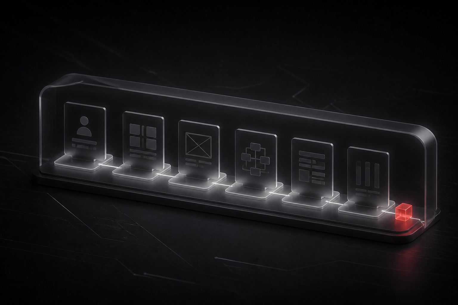
A genuine UX process moves through four interconnected phases:
- Research: understanding who will use the site, what they need, and what currently stops them
- Synthesis and Information Architecture: converting research findings into personas, journey maps, and a site structure grounded in user behaviour
- Prototyping and Design: building and iterating on testable versions of the site before any code is written
- Testing and Implementation: verifying the design works with real users, then handing it to development with the logic intact
Each phase feeds the next. Research shapes the architecture. The architecture shapes the prototype. The prototype is what gets tested. If you skip or compress any phase, the ones after it are built on assumption rather than evidence. (If you want to understand why research needs to come first, this piece on doing UX research before writing a brief explains the practical case.)
For organisations in healthcare, not-for-profit, or legal services, abbreviating any phase is not just a quality issue. It is a risk management issue: users who cannot find critical information, complete a key task, or trust the experience represent real organisational consequences, not just a poor review.
Phase 1: Research — Finding Out What Users Actually Need
Research starts before anyone opens a design tool. The goal at this stage is straightforward: understand who will actually use this website, what they are trying to accomplish, and what is currently getting in their way.
The core activities here include user interviews, stakeholder interviews, surveys, competitor analysis, and a review of any analytics or existing data the client already has. Used together, these methods give the project team a rounded picture rather than a partial one.
User interviews are structured conversations, not casual chats. A trained researcher works through a planned set of questions with real or representative users, then follows up on what they hear. These sessions surface what users are trying to accomplish, where they encounter confusion, and what causes them to abandon a task. That last point matters more than most clients expect.
Stakeholder interviews are equally important. They define what the organisation needs from this website, surface internal constraints (budget, compliance, sign-off processes), and get everyone aligned on what success actually looks like. Implementing a user-centric design approach only works when user needs and business goals are understood together, not separately.
One red flag to watch for in any agency proposal: the phrase “user research” with nothing behind it. If a proposal does not name who will be interviewed, how participants will be selected, how many sessions will run, and how findings will be documented, that is not a research plan. It is a placeholder. Rigorous research is how we build websites that actually deliver results, and the detail in a proposal tells you quickly whether an agency means it.
Phase 2: Synthesis — Turning Raw Data Into Design Decisions
Once the research phase wraps up, you have notebooks full of interview notes, survey responses, and observations. That raw material is valuable, but it is not yet useful. Synthesis is the step that converts it into something a design team can actually act on, and it is the phase most agencies either skip entirely or rush through to get to the “visible” work faster.
The outputs of synthesis are what separate a considered design process from one built on guesswork. Three of the most important are:
- Personas: Composite profiles built from patterns across your research, representing the distinct types of people who will use your site and what they care about
- Journey maps: Visual diagrams showing the steps a user takes to complete a goal, and where friction, confusion, or drop-off currently exists
- Affinity diagrams: A method of grouping themes and patterns from across multiple interviews so the team can see what keeps coming up, rather than treating each conversation in isolation
These outputs directly feed the information architecture (IA), which is the structure and labelling of content across the site. A well-built IA reflects how your users think and what they are looking for. It does not mirror your internal org chart or copy the navigation from your previous website.
This matters more than it sounds. Just as a brand strategy must come before identity design to avoid building on assumption, IA must come after synthesis, not before it.
If an agency presents a site map or IA in week one, before a single user has been interviewed, they have skipped synthesis entirely. They are designing from assumption, not evidence.
Phase 3: Prototyping — Testing Ideas Before They Become Expensive
Once your information architecture is in place, prototyping is where ideas meet reality, before a single line of code is written.
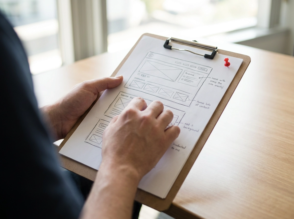
A prototype is not a finished deliverable. It is a working tool for generating feedback, and the form it takes depends entirely on the question you need to answer at that moment. Prototypes exist at three broad levels of fidelity.
Low-fidelity wireframes are rough, intentionally simple layouts. Think basic boxes, placeholder text, and simple page flows. They are not meant to look polished. Their job is to test whether the structure makes sense: can someone find what they need, and does the sequence of pages follow a logical order?
Mid-fidelity prototypes step it up. They include real navigation, actual content, and clickable interactions. These are what participants use during usability testing to complete assigned tasks. Seeing where someone hesitates, backtracks, or clicks the wrong thing is far more valuable than any stakeholder opinion.
High-fidelity prototypes bring in visual design, brand elements, and realistic content. They are used for stakeholder sign-off and final usability checks before the project moves into development.
The fidelity level progresses for a reason: each stage answers different questions, and each round of feedback shapes what comes next.
Here is a question worth asking any agency: if they hand you a static wireframe document and call that prototyping, ask what changed after users saw it. A genuine design process produces multiple iterations. A deliverable-focused process produces a PDF.
If nothing changed, the wireframes were not tested. And untested assumptions are expensive to fix once development starts.
Phase 4: Usability Testing — Watching Real People Use Your Website
Once the prototype is built, it needs to be tested with real people, and that is exactly what this phase is for.
Usability testing is not a survey, a focus group, or a client walkthrough. A facilitator asks real participants to complete specific tasks on a prototype or live site while the team watches quietly. The goal is to observe actual behaviour, not collect opinions.
Different tests answer different questions. First-impression tests check whether a homepage communicates its purpose within a few seconds. Essential task tests follow users through key journeys: making a donation, submitting an enquiry, finding a service. Each test type is chosen because it targets a specific risk in the design.
Who you test with matters as much as how many. A small group of well-recruited participants who match your actual audience will surface more actionable problems than a larger group of internal testers who already know the product. Internal testers unconsciously fill gaps that real users will not.
Every session should produce documented findings with severity ratings, so the team knows which problems are critical and which are minor. Crucially, those findings must feed directly into a new round of design changes. Testing without iteration is just observation. Nothing improves.
Accessibility testing should run alongside this process — WCAG 2.1 AA is the standard to ask about.
At Slant Digital, user research and testing sit at the centre of every website project, because a site that has not been tested against real user behaviour is a site built on assumptions.
From Design to Development: What a Good Handoff Looks Like
Once testing is done and the design is signed off, it can feel like the hard work is over. But the handoff from design to development is where a lot of good UX work quietly falls apart.
A handoff is not a file drop. It is a communication of intent. A proper handoff includes annotated prototypes that explain why elements are placed where they are, component specifications, interaction notes, and the rationale behind key design decisions. Without that documentation, developers are left guessing, and guesses introduce drift between what was tested and what gets built.
UX designers should stay involved once development begins. That means reviewing the build against the approved prototype, not just looking at it visually, but checking whether the interactions, flows, and content hierarchy match what users actually tested. When something drifts, it needs to be flagged and resolved before launch, not patched afterwards.
For more complex builds, particularly those involving custom web development or application logic, running design and development in strict sequence creates unnecessary risk. The better approach is close collaboration from the prototype stage, where developers understand the design logic early and can flag technical constraints before they become expensive problems.
The question worth asking any web design agency in Melbourne is a simple one: who reviews the development build against the approved UX design, and what actually happens when they find a discrepancy? If the answer is vague, or if the agency treats the handoff as the finish line, that is worth noting before you sign anything.
Questions to Ask Any Web Design Agency Before You Sign
Knowing how the process works is one thing. Knowing what to ask before you sign is what protects your project.
Use these questions in any pitch or proposal conversation:
- Ask for a deliverables breakdown by phase. Research outputs, synthesis documents, prototype iterations, and testing reports should all be named and dated in the proposal. Vague references to “UX work” are not a process.
- Ask how the agency handles conflict between research findings and stakeholder opinion. A mature team has a clear, structured way to navigate that tension rather than defaulting to whoever holds the loudest opinion.
- Ask about participant criteria for usability testing. How will participants be selected? How many sessions will run? What severity of finding triggers a redesign iteration? These details separate structured testing from a checkbox exercise.
- Ask whether accessibility testing is included and what standard applies. For organisations serving the public, meeting WCAG 2.1 AA standards is widely recognised as the appropriate accessibility benchmark, and any reputable web design agency should include this as a standard part of delivery.
For not-for-profit organisations and small to medium businesses, these questions are especially worth asking early. Budgets in those sectors rarely have room for the kind of rework that comes from unresolved UX problems discovered late in the build.
If you are preparing to brief an agency, the NFP website brief checklist is a practical starting point for getting your project set up correctly from day one.
What Good UX Looks Like in Practice
A genuine UX process leaves a paper trail. As covered in each phase above, every stage should produce deliverables you can review. If an agency talks about UX but cannot show you what the process actually produced, that is your answer.
That distinction matters, especially where budgets have no room for a rebuild.
The most reliable way to get a website that works for your users from day one is to work with a digital agency that embeds research, synthesis, prototyping, and testing into every project, not as optional extras, but as the method itself.
At Slant Digital, this is how we work across brand strategy, UX design, and website design and development. If you want to understand what that looks like for your specific project, start a conversation with our team and we can walk you through our process in plain terms.
Conclusion
Good UX design is not a checkbox or a project phase. It is a continuous method that runs from the first research conversation through to launch and beyond.
The key points to take away from this guide are straightforward. Every phase produces visible outputs you can review and question, and the right agency will welcome that scrutiny, not sidestep it.