

It’s Friday afternoon, and someone on your team needs to publish a newsletter, update a landing page or post to social media. They need answers fast: which logo file, which tone, which photo. Too often, the brand guidelines that should provide those answers sit unused in a shared drive, written as reference documents for designers rather than decision shortcuts for everyone else. That gap between having guidelines and actually using them is where most brands lose consistency, and no amount of page count will fix it.
This post is about building brand guidelines your team will actually use. We’ll start by clarifying what brand guidelines, a style guide and a brand kit really mean, then look at why most guidelines fail for reasons that have nothing to do with design. From there, we’ll cover what to cut, how to organise around the recurring decisions your team makes, and practical rules for choosing logos, tone of voice and photos. We’ll also explore what to do when nothing suitable exists, why templates matter, and how to tell whether your guidelines worked. By the end, you’ll have a clearer, leaner path to consistency in the wild, where it counts.
What Brand Guidelines, a Brand Style Guide and a Brand Kit Actually Mean
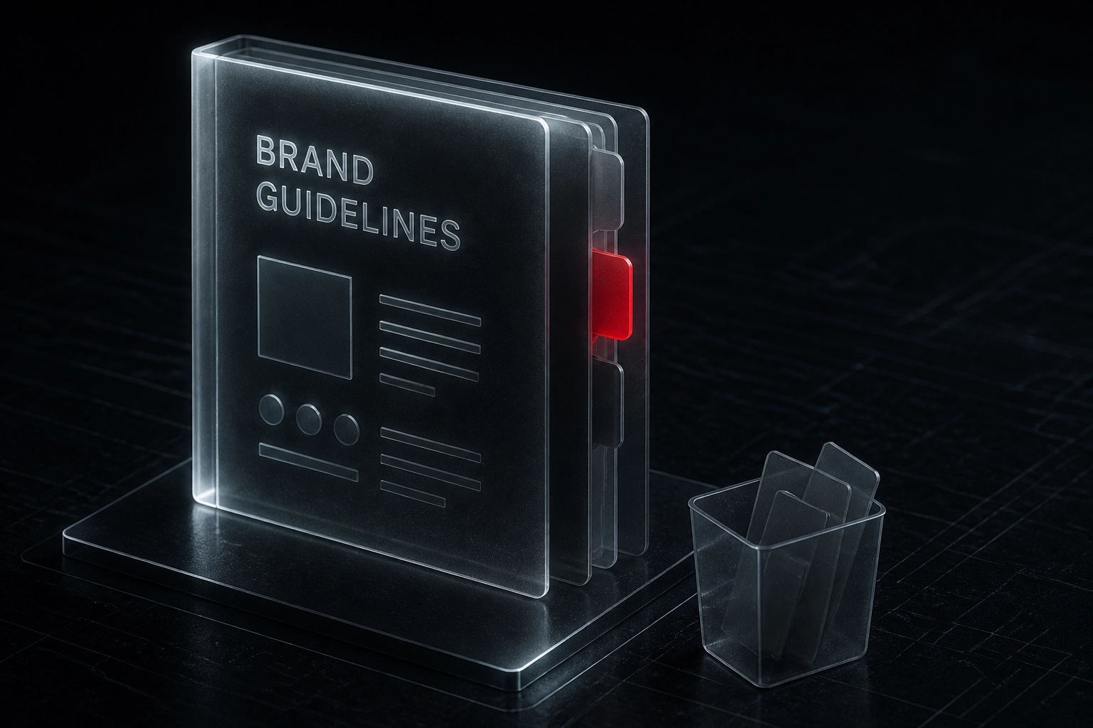
Brand guidelines are the full ruleset plus how it gets applied. A brand style guide is the visual and verbal rules inside it. A brand kit is the finished files people grab mid-task: logos, fonts, colours and templates.
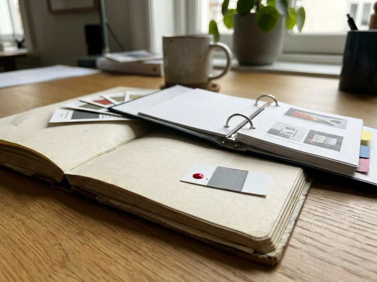
The distinction matters in practice. Someone searching for a brand kit wants a file they can drop into a document; someone searching for a brand style guide wants a rule. Answer both on one page so nobody has to ask.
Widen the frame beyond visuals. Consistency covers visual identity, brand voice, messaging and customer experience, not just logo and colour. That is also why identity design comes second.
Keep one test in mind throughout: the measure of a good document is not how complete it looks, but whether a staff member mid-task can find an answer in under a minute.
Why Most Brand Guidelines Fail, and It Is Not the Design
Most brand guidelines are not badly designed. They are unused. A widely cited Lucidpress survey, repeated by several brand-software vendor blogs, reports that 95% of companies have guidelines but only 25% to 30% actively enforce them, and that 81% struggle with off-brand content. Treat those as directional, vendor-cited figures.
The cause is audience. A reference document written for designers gets read once, then bypassed by whoever is publishing the newsletter or updating the letterhead on a Friday afternoon.
Self-reported marketer surveys put the consistency uplift at 23% to 33%, but most of this content comes from vendors selling brand platforms and asset libraries, so the conclusion is usually “buy tooling”. Ours differs: the document is decision one, tooling an optional second step. The same discipline starts upstream, with a brand brief an agency can actually use.
That matters more now that 85% of marketers use AI content tools (vendor-reported), generating more drafts and more small decisions weekly. A decision shortcut beats a rulebook.
What to Cut From Your Brand Guidelines
If the document exists to help someone decide, anything that doesn’t help them decide is weight. Six things to cut:
- Page-count vanity. Logo origin stories, values essays, timelines and mood boards show the work was done. Move them to an about page or into the strategy deck where brand positioning is already mapped.
- Specs nobody uses. Keep hex and RGB values for screen, one print note if you genuinely print, and one accent rule. Delete the wall of tints, weights and Pantone variants unless a named person needs them for a named job.
- Rules nobody can action. “Be bold but professional” is not a decision. Rewrite it as a choice between two options, or delete it.
- Anything without an asset. If a rule needs a template, file or example that doesn’t exist, ship the asset or take the rule out.
- Duplicated content. Link to your accessibility statement, image library or tone of voice research rather than pasting it in.
- Chapters with no decision. Ask of every page: what question does this answer, and who asks it?
What survives that test becomes the skeleton of the document, organised around the decisions your team actually makes.
What to Put In: Organise Around Decisions, Not Disciplines
Now that you have cut the excess, build the contents page around decisions rather than design disciplines. Your brand style guide should answer four recurring questions: which logo, which tone, which photo, and what to do when nothing suitable exists.
Start with a decision audit. Collect your last ten publishing requests, briefing emails or quick questions and tally the repeats. That tally is your contents page. Order sections by how often the question comes up, not by brand convention. If most queries are about logo versions, that section goes first.
Keep each decision to one screen: the default answer, the exceptions, and the file to use. A reader should resolve a question without scrolling. Include one worked example per decision, using a clearly labelled composite scenario, never a real client or invented result.
Finally, cap the document at eight to fifteen pages of decisions plus templates. That range keeps a brand kit maintainable for a not-for-profit or small business team, and it mirrors the ownership clarity you need elsewhere in your NFP website governance.
Which Logo? Rules That End the Question Fast
Logo questions fill most inboxes, so lead with this page.
- Primary horizontal: website headers, email signatures, signage, presentation footers.
- Stacked: document covers, sponsor strips.
- Icon only: favicon, social avatar, app tiles.
- Monochrome reverse: dark backgrounds.
Minimums: 24px for the icon and 120px for the horizontal on screen, 10mm and 30mm in print. Clear space is the height of the letter S in your logo name on all sides.
Backgrounds: photography takes the reverse over a clear area or solid overlay; brand colour takes the reverse; white takes primary; in-between tones get a solid panel behind the mark.
Replace the nine-panel grid with one bad example: logo stretched across a busy photo in the wrong colour. Two sentences on why it fails, and why a logo can look right and still not register.
Files sit in one shared folder linked from page one: SVG and PNG for screen, EPS or PDF for print.
Partners: the brand leading the marketing effort leads the lockup. Request their vector files and co-branding rules before building one.
Which Tone? Writing Rules With Three Before and After Examples
Logo settled. Tone is the next Friday decision. Rewrite three samples:
Newsletter. Weak: “We’re excited to announce…” Strong: “Our program starts in March. Here’s what it means for you.” Rule: lead with the reader’s next step.
Social. Weak: “Don’t miss out!!!” Strong: “Applications close Friday. Apply in 10 minutes.” Rule: one action, no urgency theatre.
Error. Weak: “Oops! Something went wrong.” Strong: “We couldn’t save your form. Check your connection and try again.” Rule: say what happened, then what to do.
Set tone by situation: calm in bad news, warmer in thank-yous, factual in transactional emails. For freelancers: second person; contractions yes; average 15 words; spell out acronyms first use; exact job titles and program names. Keep a 12-item “we say / we don’t say” list (create/register, for example/eg) and review twice yearly. The NFP website brief checklist keeps voice decisions visible.
AI rule: prompt “Plain, warm, direct, second person,” then require human review before publishing.
On brand for a funding appeal: “Last year, 240 local families used our food service. A $40 gift covers a week of staples. Donate today.”
Which Photo? Imagery Rules People Can Apply on the Spot
With tone settled, imagery is the next Friday decision. In your brand style guide, write one paragraph covering subject matter, framing, natural light and, most importantly, whether you use stock or real photos of staff, volunteers and clients. Most teams need the stock answer, not a photography essay.
Lock crop ratios per channel: square for social avatars and grids, 16:9 for web banners, portrait for print and documents. Add alt text that describes purpose, not just appearance, written consent for identifiable people, and where approved images can and cannot be reused.
State where the image library lives (a shared folder is fine), who can add to it, and how long requests take. Finish with a one-line grading note on warmth, contrast and saturation, plus two sample images showing approved versus off-brand treatment.
What to Do When Nothing Suitable Exists
Sometimes the approved image library and the templates still leave you stuck. Say so, then make the fallback obvious.
Publish the escalation path: who to ask, how fast they reply (one business day, say), and what to do if they don’t answer. Without it, people improvise and the guidelines lose.
Four no-approval defaults: a text-only layout, the icon logo on a solid brand colour, an approved pattern asset, or a landscape photo from the library.
Hard nos for one-off assets: unlicensed images, competitor imagery, screenshots of other organisations’ work, and the sector cliches you have retired.
Ship two “when in doubt” layouts, landscape and square, with text placeholders, so anyone can produce something clean in ten minutes.
Then give explicit permission to publish something plain. A quiet, correct layout beats a rushed, off-brand one, and saying so out loud removes the pressure that creates workarounds.
Ship It With Templates, Not Just Rules
Defaults cover the gaps; templates prevent them. Ship the files that stop the most common errors: email signature, social post set, document and report cover, slide deck, letterhead, event or program flyer, and a simple newsletter header.
Templates beat rules because they remove the choice. A locked layout with correct margins, fonts and logo placement stops the mistake a written rule can only ask people to avoid.
Put every template in one obvious place and link it from page one, not page 34. If people hunt, they build their own version. Add light version control: a date on each file, a named owner, and a short changelog.
Be honest about tooling. Brand platforms and digital asset libraries help at volume, but they only enforce a document that already works. A shared folder is a legitimate start. For not-for-profits and small businesses: make the decisions, write them down, ship the templates, then consider software if volume justifies it. If strategy or identity is unclear, rules keep changing. Slant Digital’s brand strategy and brand identity design work gives you a decision worth documenting. If you are funding template design, our guide to website design pricing in Australia explains what drives cost.
How to Tell If Your Guidelines Worked
Templates only prove their worth once used, so measure output, not effort.
Each quarter, pull ten recent public-facing pieces across channels and score them against the decision list: right logo, right tone, right imagery, right template. Watch the volume of ad hoc questions to the designer or brand owner; fewer “quick ones” means people are finding answers in the document. Track how many newsletters, reports and social posts were built from the templates this quarter, a far better signal than download counts.
Skip page count, approval chain length and any brand recall claim you cannot support. Revenue figures in circulation are self-reported survey data, so never present them as proof your document works.
When the same question keeps arriving, fix the document. A repeated question means the rule is missing, buried or unclear. Guidelines are a living file, not a finished artefact.
Frequently Asked Questions About Brand Guidelines

What should a brand style guide include?
Include decisions your team makes most: approved logo versions and minimum sizes, colour and type rules with use cases, tone guidance with before/after examples, imagery rules, approval defaults, and links to templates.
What is the difference between a brand kit and brand guidelines?
A brand kit is files. Brand guidelines are decisions about when to use them; either is limited without the other.
How long should brand guidelines be?
Roughly eight to fifteen pages of decisions for a not-for-profit or small business team, plus templates. Length is not the measure.
Where can I find brand guidelines examples worth copying?
Study public style guides from comparable organisations in your sector for decision structure, worked examples and templates, not visual design.
How do we enforce brand guidelines without becoming the brand police?
Make the right option easiest. Ship templates, name one owner, and review quarterly rather than policing every asset.
Your Next Step Is a Decision Audit, Not a Redesign
Your guidelines need action, not more analysis. This week, collect your last ten publishing requests and note the repeated questions. That list is the table of contents for a brand style guide your team will actually use. Then cut one page nobody has opened in a year, and rewrite one vague rule as a choice between two options.
Next, ship one template for your most frequent request, whether that is a newsletter header, an email signature or a report cover. If your templates need a digital home, custom web development in Melbourne can support how those files are presented and accessed, but start with the files themselves. Book a quarterly consistency check and treat the document as a living file that changes when the same question keeps coming up.
If the brand strategy and identity underneath the document are still unsettled, decisions will keep shifting and the guidelines will keep being rewritten. Slant Digital works with organisations on brand strategy and brand identity design, so the rules you publish are documenting choices that have genuinely been made.
Conclusion
Effective brand guidelines are not about control. They are about making the right choice the easiest one. This post has shown that you should cut the fluff, organise rules around real decisions like which logo or tone to use, and ship templates that help your team move faster. The final takeaway is simple: a decision audit beats a full redesign every time.
Your next step is practical. Collect your last ten publishing requests, rewrite one vague rule as a choice between two options, and ship one template for your most frequent need. Slant Digital can support the brand strategy and identity work that makes these rules stick, but the action starts with you. Treat your guidelines as a living file. Small, consistent improvements today will build a brand your whole team can use with confidence.